


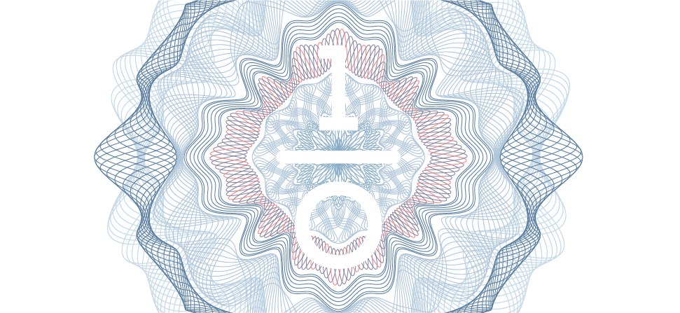


This design was created deliberately to form an ambigram. The personality and definition of the word “Versa” demands that an attempt be made to make the logo readable even upside down. To this day I’m pretty proud of this piece we did with Clarence who’s apparently defected to the world of theatre. I call it our “scientific” piece.
Advertising Agency: Attack CMG, Creative Director: Jef Tan, Art Director: Jef Tan, Typographer: Clarence Ng, Published: 2004