This week’s selection is based on overall character and general wackiness. I don’t see them being used beyond poster designs or just as a means for mischief by typographic aficionados. I picked them based on their artistic slant and how they push the limits of functional alphabetic boundaries.

First off is the Kama Sutra, used in Penguin’s recent release of the same title that makes graphic what was previously awkward. This one is tearing up on social media. I couldn’t help but notice that the letter ‘G’ features two men. Oh the artist and typographer! Visit Lost At E Minor’s tribute which is my favourite here.

The second one rides on the current flood of Marriage Equality discussions. Aptly named Equality Sans, it takes on the ‘Equal’ sign of solidarity that took over many a Facebook profile photos and turned them into alphabets. Watch out for the Equality poster nearest to you. First seen on Fast Co Design’s feature. Font is free to download, all here.
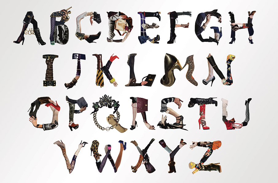
Last one might have a few of you up in arms (and legs). I find it extremely funny not because it’s been done to death by many a craft classes but the imagination to have this expressed according to the fashion seasons is just plain crazy. Also, colourful to have. Thanks Taxi for spotting this!


